Metal vs. Crypto - Rolling Correlation
1 min read.
Rolling Correlation
The Rolling Correlation chart lets you measure how closely a precious metal and a market asset move together over time. This tool can help you spot changes in market behavior, diversification opportunities, and hidden trends.
How to Access This Screen
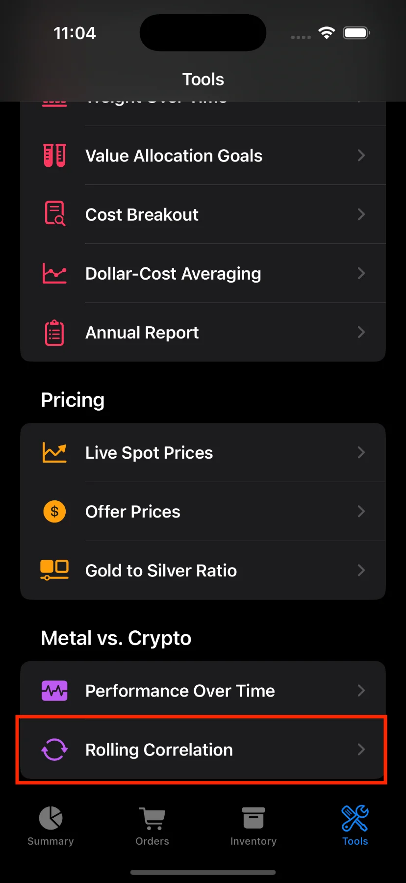
- Open the app and tap the Tools tab at the bottom.
- Scroll down and tap Rolling Correlation.
What You’ll See
At the top of the screen, you’ll find:
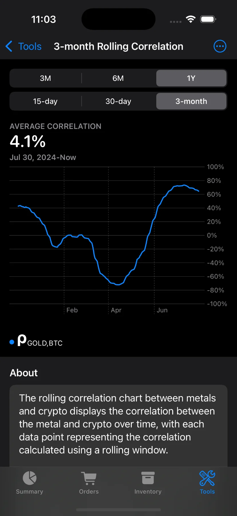
- Chart title: Shows the selected window size (e.g., “3-month Rolling Correlation”).
- Segmented pickers: Customize both the time range (e.g., 1M, 3M, 6M, 1Y) and rolling window width (1M, 2M, or 3M).
Note: Some options are available to Pro users only. If you try to use them without a subscription, you’ll see a prompt to upgrade.
Understanding the Chart
Use the toolbar to select the metal (Gold, Silver, or Platinum) and the comparison asset (S&P 500, Bitcoin, or Ethereum).
The line chart shows how the correlation between the selected metal and asset has changed over time:
- A value near +100% means the assets moved together closely.
- A value near –100% means they moved in opposite directions.
- A value near 0 suggests little or no relationship.
You can tap and drag on the chart to see the correlation at specific dates. The average value for the selected period is also shown at the top.
Why Use This?
Correlation data helps you:
- Understand if your selected metal and asset tend to move together.
- Evaluate diversification — low correlation might reduce portfolio risk.
- Spot changing dynamics in the relationship between metals and other markets.
Have questions or feedback? Reach out via the app’s Send feedback section!