Metal vs. Crypto - Performance Over Time
1 min read.
Compare how a precious metal performs against a market asset (S&P 500, Bitcoin, or Ethereum) over time. This chart visualizes percentage changes side-by-side so you can spot trends, evaluate potential, and make informed decisions.
How to Access This Screen
- Open the app and tap the Tools tab at the bottom.
- Tap Performance Over Time in the list.
What You’ll See
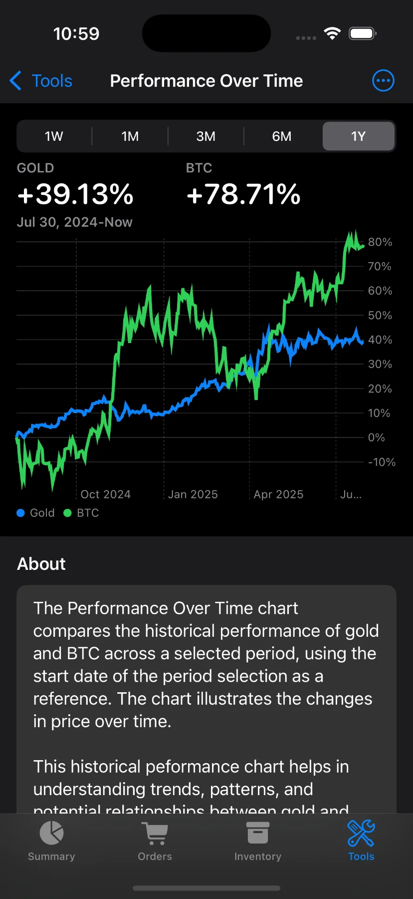
At the top of the screen, you’ll find a dual summary showing the performance change:
- Gold (or another metal of your choice)
- BTC (or ETH, depending on your selection)
Each shows the percentage change over the selected time range—like +39.13% for gold and +78.71% for BTC over 1 year, for example.
Change the Timeframe
At the top, you can choose different time ranges:
- 1W – One week
- 1M – One month
- 3M – Three months
- 6M – Six months
- 1Y – One year
These are available to Pro users only. If you’re not a subscriber, you’ll be prompted to upgrade when trying to change the timeframe.
Chart Details
- The chart below shows the percentage change for each asset (metal and crypto) over time.
- Blue line: The selected metal (e.g. Gold)
- Green line: The selected comparison asset (e.g. S&P 500, BTC, or ETH)
- Y-axis labels are formatted as percentages to help you quickly spot outperformance.
Customize Your Comparison
Use the toolbar to change:
- Metal: Gold, Silver, or Platinum.
- Comparison asset: S&P 500, Bitcoin (BTC), or Ethereum (ETH).
About the Chart
A short explanation below the chart provides context:
“The Performance Over Time chart compares the historical performance of gold and BTC across a selected period… It helps in understanding trends, patterns, and potential relationships between the two.”
Have questions or feedback? Reach out via the app’s Send feedback section!