Gold to Silver Ratio
1 min read.
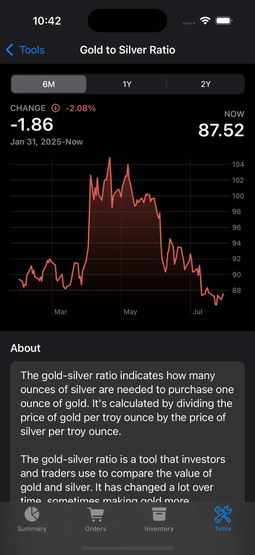
The Gold to Silver Ratio chart helps you compare the relative value of gold and silver over time. It shows how many ounces of silver are needed to buy one ounce of gold. When the ratio is high, silver may be undervalued—some investors see this as a buying opportunity.
How to Access This Screen
- Open the app and tap the Tools tab at the bottom.
- Scroll down and select Gold to Silver Ratio.
What You’ll See
- A dynamic chart showing the ratio’s trend over time.
- The current ratio (NOW) on the right side.
- The change in ratio (↑ or ↓) and percentage difference for the selected period.
- A historical view starting from a date like “Jan 31, 2025” to “Now”. The starting day will change based on the selected period range.
Choose a Time Period
At the top of the chart, you can switch between different timeframes:
- 6M: Last 6 months
- 1Y: Last year
- 2Y: Last 2 years
These are available to Pro users only. If you’re not subscribed, you’ll see a prompt to upgrade when trying to change the date range.
Chart Features
- Interactive chart: Tap and hold the chart to explore the ratio at specific dates. The value and date update live as you move your finger.
- Color-coded change indicator: The app shows green or red highlights depending on whether the ratio has increased or decreased.
About the Ratio (Below the Chart)
The bottom of the screen includes a detailed explanation of what the gold-silver ratio means, how it’s calculated, and why investors track it.
Have questions or feedback? Reach out via the app’s Send feedback section!